 Change Background
 Configure Columns

 Change BackgroundConfigure Columns
 Search
 Settings
 Account
 Contact SupportHelpSearch
 Archive nowSettingsContact SupportHelpArchive nowSettingsContact SupportHelpSettingsContact SupportHelp
 RenameSettingsContact SupportHelp
 StyleRenameSettingsContact SupportHelpSettingsContact SupportHelp
 Lists
Your home screen shows your lists - at first you have just one called "Default". You can create other lists, for example "Home", "Work", "Shopping" or "Travel".
Tabs
Click on the name of a list to go to that list. You will then see three tabs, for items you need to do "Now", "Next" and "Later". This allows you to organise your tasks logically by priority, without specifying exact times. Within each tab you have a list of todo items, initially empty.
 Todo items
You can press the "+" button to add a new item. Type in a few words to summarise the item, then press OK to add it to your list. For example, you might enter "Paint fence" or "Book hotel".
 Changing plans
Once you have some items you probably want to rearrange them as you prioritise your tasks. Touch an item to select it (if not already selected), then press the 4-way-arrows icon to open the movement controls. You can move the item up or down, straight to the top or bottom, or left and right to send it to another tab. You can also move it to another list.
 Annotations
To edit an existing item, select it and press the edit button, or tap it a second time. You can change it's status or color, add a label or star it. There's also a button to attach a description, where you can provide more detail or information such as a link or address.
 Completing tasks
When you have completed a task, select it and then press the checkmark icon to mark it as done. It will turn green to indicate that you completed it.
 Archive
When things start to get cluttered, press the scroll icon in the top-right corner to go to the archive for that list. Once in the archive you can press the snowflake icon to archive all completed items from the list. The completed items will no longer take up space in your list columns, but the archive shows a chronological history of everything you have achieved.
 Subtasks
You can break larger tasks into subtasks. Pressing the black triangle button allows the selected item to have subtasks, which are indented beneath it. Once you have added subtasks, pressing the triangle button again on the main task hides or expands the subtasks.
 Sync
Be sure to check out quick-list.org on desktop/laptop, for a bigger-screen todo list experience and more customisation. Your lists sync automatically between this and mobile.
 Documents
The built-in QuickText mode allows you to store, view and edit text documents in the cloud, so you can keep your notes handy. You can create documents within a folder hierarchy you define. Tap a document or folder to open it, or long press to rename, duplicate or delete.
Lists
| Create list |
 | Delete list |
 | Reorder lists |
 | Reorder lists |
 | Configure list |
List items
| Move item |
| Edit item |
| Subtasks |
 | Mark done |
| Add item |
Movement
 | Move up |
 | Move down |
 | Move to top |
 | Move to end |
 | Previous column |
 | Next column |
 | Delete item |
 | Move to list |
 | Duplicate item |
 | Close movement |
Archive
| View archive |
| Archive now |
System
| Settings |
| Account |
| Help |
QuickText Documents are formatted with the following Markdown-like syntax. You must separate these from all other text with a space.
Headings
| >> | Heading |
| > | Sub-heading |
| --- | Horizontal rule |
Lists
| - | List item |
| . | Sub-list |
| -(1) | Numbered list |
| -(a) | Alphabetic list |
Inline formatting
| *Bold* |
| /Italics/ |
| _Underline_ |
| ~Strikethrough~ |
| `Monospaced` |
Colors and Images
| %color | Change text color |
| %. | Reset text color |
| !ImageName | Image or Glyph |
Tables
| Example row: |
| | Text | Text | Text || |
| Table types: |
| %table, %chart, %cols, %rows, %grid |
Boxes
| {: Standard box } |
| {; Bright box } |
| {= Dark box } |
| {. Outline box } |
| {%color Colored box } |
| { Layout box } |
| {X Hidden box } |


Cancel
Forgot password?
Cancel login
| Email: |
Cancel
Password successfully reset.
Click below to sign in.
Email successfully validated.
Click below to sign in.


David Allen, the author of Getting Things Done, explains that in order to be productive and happy you need to be able to focus on what you are doing, whether that's a meeting at work or spending time with your family. The reason that's tricky in the modern world is that there are so many demands on our time. Your brain is wired to constantly nag you about the things you need to do. This isn't helpful - there's no point reminding yourself you need to buy bananas when you're not in the store, and there's no point remembering to send an email when you're going for a run.
The solution is to write things down in a To Do list. Once it's committed to a system you trust, you naturally relax and can clear your mind, since you know it's being tracked. Your brain isn't easily fooled though - it needs to believe that you will come back and review your list regularly, or you will start worrying again. So you need a list you can access frequently, and make a habit of doing so.
Of course, remembering things isn't the only thing making us stressed. The other problem is that we have more things to do than we have time for. How do we know what's important? Having a system which lets you prioritise things, and also categorise them, enables you to check you are actually making progress on the things which really matter, and not wasting time on all those seemingly urgent but unimportant tasks.
QuickList is designed single-mindedly to address this, enabling you to relax, focus, get things done, and make sure you accomplish what you care most about. First and foremost, the need to review your list regularly can be a lot of work with other systems. To be effective you need to check it at least daily, preferably more, reviewing your list at the start or end of each day, as well as when you're unsure what to do next. This is why QuickList is quick - it doesn't waste your time on admin.
QuickList is developed by Simplified Systems Consulting.
Copyright © 2022-2026.
We're passionate about productivity, but found existing todo apps either too limited or just too slow and cumbersome; we use QuickList continuously to keep us organised.
Get in touch! Contact info@quick-list.org


QuickList is developed by
Simplified Systems Consulting.
Copyright © 2022-2026.
We're passionate about productivity, but found existing todo apps either too limited or just too slow and cumbersome.
Get in touch! Contact info@quick-list.org
The free plan gives you access to all the main features, and never expires - start here.
Upgrade to premium to maximise your personal productivity.
| Version | Basic | Premium |
| Price (pay monthly) | Free | $4.00 / month |
| Price (pay yearly) | Free | $2.50 / month |
| Storage | ||
| Number of lists | 6 | 36 |
| Items per list | 36 | 600 |
| Archived history items per list | 250 | 10000 |
| Max note length | 400 | 4000 |
| Max columns | 3 | 6 |
| Single file size | 50k | 250k |
| File storage | 1 MB | 100 MB |
| Resources | ||
| Item colors | 4 | 20 |
| Sound effects | 4 | 20 |
| Background images | 9 | 111 |
| Label symbols | 16 | 122 |
Bonus premium features: Import/Export, Dark mode
The free plan gives you access to all the main features, and never expires.
| Version | Basic | Premium |
| Price (monthly) | Free | $4 |
| Price (annual) | Free | $30 |
| Storage | ||
| Lists | 6 | 36 |
| Items / list | 36 | 600 |
| Archived | 250 | 10000 |
| Note length | 400 | 4000 |
| Max columns | 3 | 6 |
| File size | 50k | 250k |
| File storage | 1 MB | 100 MB |
| Resources | ||
| Colors | 4 | 20 |
| Sounds | 4 | 20 |
| Backgrounds | 9 | 111 |
| Symbols | 16 | 122 |
Bonus premium features: Import/Export, Dark mode

 Lists contain Todo items.
Name:
Default color for new items:
 Dashboards filter items from other lists.
Name:
| Import | |
| Text only. Add items to the list at current cursor position. Reads one item per line from an input text file. | |
| All fields. Upload a CSV file in the backup format, to create a new list. | |
| Export | |
| Text only. Download list items to CSV file. Compact layout with multiple items per line (columns side by side). | |
| All fields. Write list contents to CSV file. Detailed layout with one item per line. | |
| Archived items. Downloads full list archive to CSV file. One item per line. | |
| Sources: |
None selected
|
||||||||
| Status: | |||||||||
| Colors: |
|
||||||||
| Stars: | |||||||||
| Labels: |
|
||||||||
| Date: |
|
|
| Background |
| Storage | Basic | Premium |
| Number of lists | 6 | 36 |
| Items per list | 36 | 600 |
| Archived per list | 250 | 10000 |
| Max note length | 400 | 4000 |
| Max columns | 3 | 6 |
| Single file size | 50k | 250k |
| File storage | 1 MB | 100 MB |
| Resources | Basic | Premium |
| Item colors | 4 | 20 |
| Sound effects | 4 | 20 |
| Background images | 9 | 111 |
| Label symbols | 16 | 122 |
| Storage | Basic | Premium |
| Lists | 6 | 36 |
| Items / list | 36 | 500 |
| Archived | 250 | 10000 |
| Note length | 400 | 4000 |
| Max columns | 3 | 6 |
| File size | 50k | 250k |
| File storage | 1 MB | 100 MB |
| Resources | ||
| Colors | 4 | 20 |
| Sounds | 4 | 20 |
| Backgrounds | 9 | 111 |
| Symbols | 16 | 122 |
Bonus premium features: Import/Export, Dark mode
| Billing: | Monthly | Annual |
| Price per month: | $ | $ |
 Cancel Subscription?
This will remove your access to premium features, and reduce your storage space to basic levels.
| First name: | |
| Last name: | |
| Email: |
Getting things you want to do out of your head, and into a reliable system is the first step to becoming more organised, relaxed and focussed. Let's do it!

To create new todo list items at the end of a column, click the "+" sign below the column heading or press the + key.
To insert items at the cursor position, click the add button in the toolbar, or press the Insert key.
Tip: nearly everything in QuickList can be done rapidly via keyboard controls. Use the cursor keys to move around and check the Shortcuts help section for available commands.

Quicklist has a simple way to order tasks. Within every list you can place items in one of three columns, called Now, Next and Later. "Now" is for things you need to do right away. "Next" is for things you don't plan to start immediately but are next in line, perhaps for tomorrow or next week. "Later" is for everything else you want to keep track of but won't get done any time soon.
Tip: ordering should depend not only on urgency, but also take into account importance. Be sure to place some bigger tasks of strategic importance into "Now" along with the smaller less important tasks which seem urgent at the time.
You can move items between columns with these buttons, or press Shift-Left/Right, or drag-and-drop.


Once you have completed an item, you can mark it as "done" with the checkmark button, or by Ctrl-clicking it, or by pressing the Space bar if the item is selected. Completed items will turn green but stay visible in your list. This lets you see everything you have accomplished.
Once things start to get cluttered you can use the freeze (archive) button, or press Alt-A, to move all completed items from the list into the archive. Once archived, items can no longer be edited.
You might choose to archive items daily, weekly, or whenever you like.

Tip: It's better to mark tasks as done and then archive them rather than using "delete". Reserve delete for tasks you decide are unnecessary and won't be done.

You can switch between displaying the current items and the archive at any time with the scroll button, or by pressing the Tab key.
The archive gives you a chronological history of everything you have completed in the past. Items are listed under the date when you marked them as completed, not when you archived them, so you can accurately tell what you accomplished each day.

Rearranging
Plans change! Stay organised by rearranging the order of items within a column frequently using these buttons.
You can also move the selected item with the Shift-Up/Down keys, or drag it into a new position using the mouse.
Editing
Edit the text of an item by clicking the edit button in the toolbar, double-clicking the item, or select it and press Return.

Descriptions
You can attach a longer description to an item to provide additional information.
To do this, click the indicated toolbar button or press the # key.
Items which have an attached description can be identified by the paperclip symbol.

Once you are productive, the next step is to pay attention to the type of items you are completing. Labels help you do so by categorising items. Simply completing a bunch of incidental items may not have much result. Use labels to ensure that you are making progress on your most important goals.

Labels
The "manage labels" button in the toolbar allows you to create labels. A label has a name and a symbol. Once created, you can add labels to list items when you edit them.
 Premium accounts are supplied with additional symbols, which you can use to create labels
for more activities.
Stars
For quickly flagging an item for special attention you can also star it. Use the toolbar button or press the * key to add a star. Items may have a label as well as a star.
Items have one of four possible statuses: To do, In progress, Blocked, or Done. The initial state is To do. The status can be changed when editing the item.
In progress items
If you have done some work on a task but not completed it by the time you review your list, you may choose to mark it as "in progress".
If the item will take a very long time to complete, consider breaking it into subtasks instead.


Blocked items
Sometimes it may not be possible to address an item because you are waiting for something else to happen first. You might need a delivery to arrive, or someone to call you back.
When this happens you can click the pause toolbar button (enable it in Settings first) or press the Pause key. The item will appear in grey so that you know it is currently blocked, but don't forget it.
Colors
You may select a color for each list item. This can be done when creating a new item or editing an existing item.
Premium accounts include an extended color palette.


Setting item color
When editing an item, click on the palette symbol to expand the color palette. Then select the color you require.

Default color
You can also configure the default color for list items created from a particular list. To do this, click the edit list button in the toolbar. Initially the default for all lists is white.
Lists
Your list items can be organised into separate lists for different topics. Each list comes with it's own Now, Next and Later columns.
Lists are useful to group together items which can be done in different contexts, for example at work, when shopping, at the gym or library etc. There is no point being reminded of items which you cannot complete in your current context.
To begin with you have a single list called "Default", but you can rename that and create additional lists. In this example we have three lists:

The contents of the selected list will be shown in the columns below this. Switch to a different list by clicking on it's name, or cycle through them with the Comma and Period keys.
There are five highlighted toolbar buttons on the right, which allow you to create, rearrange (left or right), setup and delete lists respectively.
With the setup list button you can rename the list, and also optionally choose a background image to make the list more recognisable.
Premium accounts
provide a large library of additional background images.
In-tray
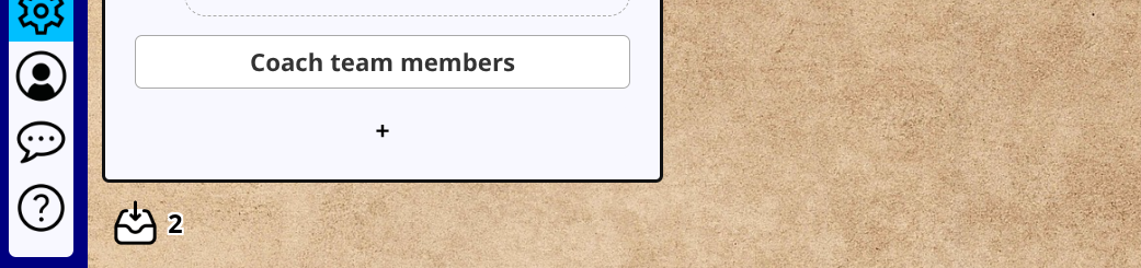
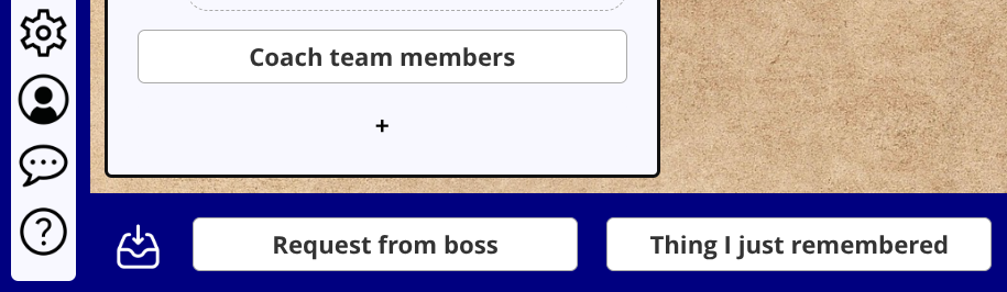
The tray icon at the bottom of the screen is used to show your in-tray. You can also access it with the ^ key. If there are items in the in-tray, the number is displayed next to the icon.
Once expanded, you can add new in-tray items, or move items from the in-tray to a list and column of your choice.

Adding subtasks
Press the subtasks button in the toolbar to convert a task into a supertask. You can then add subtasks to it with the dotted "+" button below, or by moving existing tasks into the group.
Subtasks are displayed indented from normal tasks.
Showing and hiding subtasks
Select the supertask, then press the toolbar button again to hide it's subtasks until you are ready to work on them. Another press of the button will reveal the subtasks. You can also do this with the = key, or by Ctrl-clicking on the supertask.
Supertask status
The status of supertasks is automatically calculated. When at least one of the subtasks is completed, the supertask is shown as in progress.
The supertask is set to done once all subtasks have been completed.

Tip: another way to organise items is to insert an item with empty text. This creates a separator which you can use to divide the items in a column into sections.
Use dashboards to filter your tasks. To get started, select "Create new list" and then click on the "Create dashboard" tab. Once you have a dashboard, click on the filter button at the top of a column to select what that column will show.
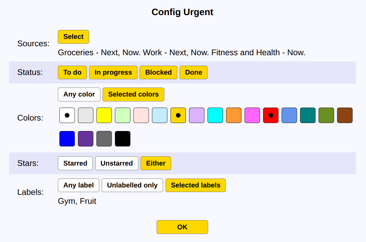
Start by selecting your sources. These are the columns from all your lists which you want to filter items from.
Next you can specify the filter criteria. You can filter based on item status, color and/or label, or for starred items.
Once you click "OK" the dashboard is set up and will automatically update. Dashboard items cannot be rearranged but you can edit or complete them as usual. The indicator next to each item shows which list that item comes from; click on this to jump straight to the source item.

Select features to display
Use Settings to streamline the user interface, so it includes the features you need and hides the rest.
You can select the buttons shown on the toolbar, and also the options in the menu presented when right-clicking on a list item.
Custom column names
Click on any of the column names (Now, Next or Later) to configure it. You can rename the columns as you see fit, and have different column names for different lists.
In this example the Next column has been renamed to Tomorrow.
Variable number of columns
You may also vary the number of columns in a particular list by adding or removing them as required.
The minimum number of columns in a list is 1, and the maximum is 3.
Premium users can increase the number of columns to 6.


Your list data is stored securely in the cloud. If you make changes on another computer or browser window, press the sync button to refresh the display with the latest information.
You can also access your lists from a mobile device to check your todos or make quick edits on the go. Visit quick-list.org using your phone or tablet's browser. Quicklist displays a more compact interface on mobile devices.
AccountClick on the account button to see your account information, upgrade your account, or change your password.
HelpAccess this information with the help button or by pressing the ? key.
Get in touch! Please send bug reports, feature suggestions or questions to:
info@quick-list.org
Written by David Ingram. Copyright © 2022-2026.
Produced by Simplified Systems Consulting Ltd.
Background images courtesy of the awesome Unsplash. Check them out for your image needs!
Symbols provided by the excellent Flaticon.
QuickList stores your data including name, email address and todo list items in order to provide a todo list service. None of your data is accessible to other users of QuickList or the general public unless you explicitly choose to share it.
QuickList staff may access your data when necessary to improve the service or investigate issues, or in aggregate to provide usage statistics. QuickList does not share any data with third parties.
| Insert | Add new item at current position |
| + | Add new item at end of column |
| Cursor left / right | Navigate between columns |
| Cursor up / down | Navigate items within a column |
| Home / End | Navigate to top/bottom of the column |
| Alt - F | Find item |
| Return | Edit selected item |
| Space | Mark item as done |
| * | Star item |
| / | Label item |
| Alt - I | Mark item as in-progress (partially done) |
| Pause, or Alt - P | Mark item as blocked / resumed |
| Shift - Return, or # | Add or edit a description of an item |
| Delete | Delete item (will not be archived) |
| = | Hide / show subtasks |
| Shift - Cursor up / down | Reorder items in a column |
| Shift - Home / End | Move item to top/bottom of the column |
| Shift - Cursor left / right | Move item to adjacent column |
| 1, 2, 3 (and 4, 5, 6 if premium) | Move item to another column |
| Alt - M | Move item to another list |
| Tab | Switch between current and archived items |
| Alt - A | Archive completed items now |
| Alt - E | Import / export (premium feature) |
| ^ | Show / hide in-tray |
| ; | Select in-tray |
| & | Create item in in-tray |
| Alt - T | QuickText documents |
| $ | Stats |
| ; | Todo lists |
| Alt - D | Duplicate item |
| Alt - S | Set all done / undone |
| Alt - L | Manage labels |
| , . | Switch to a different list |
| <, > | Rearrange list sequence |
| Ctrl - Insert | Create list |
| Ctrl - Delete | Delete list |
| Ctrl - Return | Rename / setup list |
| Alt - C | Configure column |
| % | Settings |
| ! | Account |
| Alt - R | Refresh to show latest changes |
| Alt - Q | Logout |
| Escape | Abort any operation |
| " | Contact support / send feedback |
| ? | Show this help |
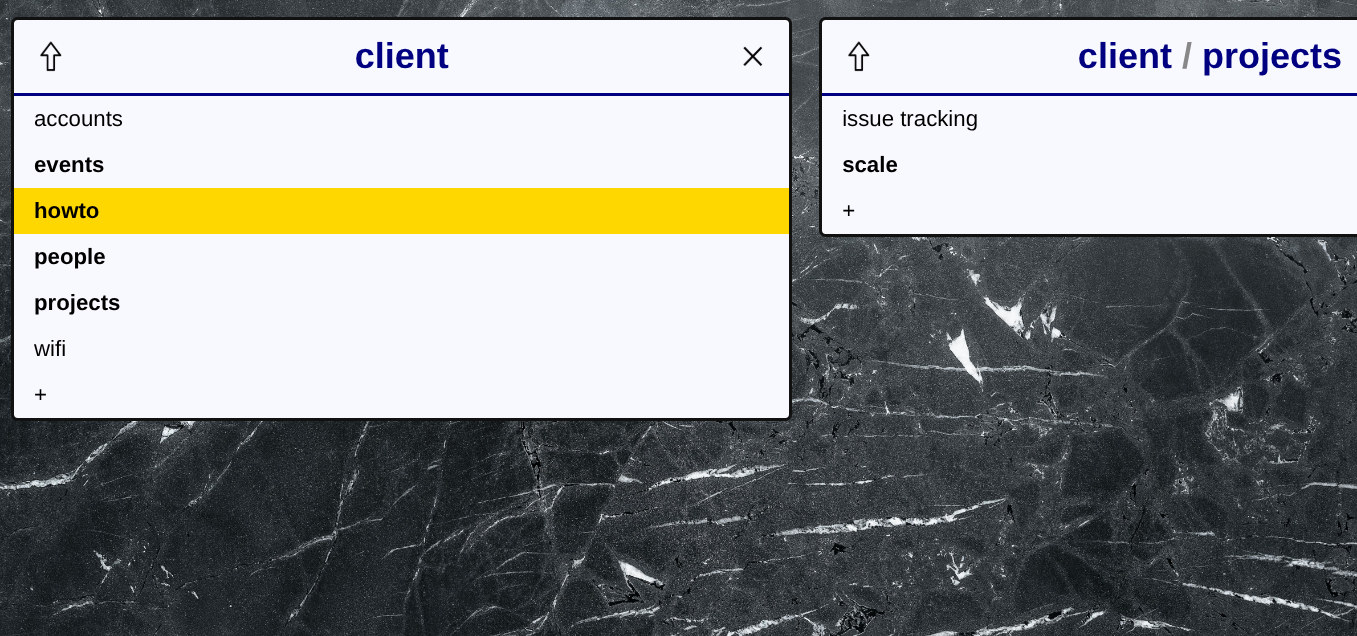
Organising documents
Press in the sidebar to open QuickText.
create new documents and folders.
Use the toolbar to rename,
duplicate
and delete these.
To move documents or folders, use the  split screen button;
you can then use the move buttons in the toolbar to send items to another folder, or drag and drop them to the other pane.
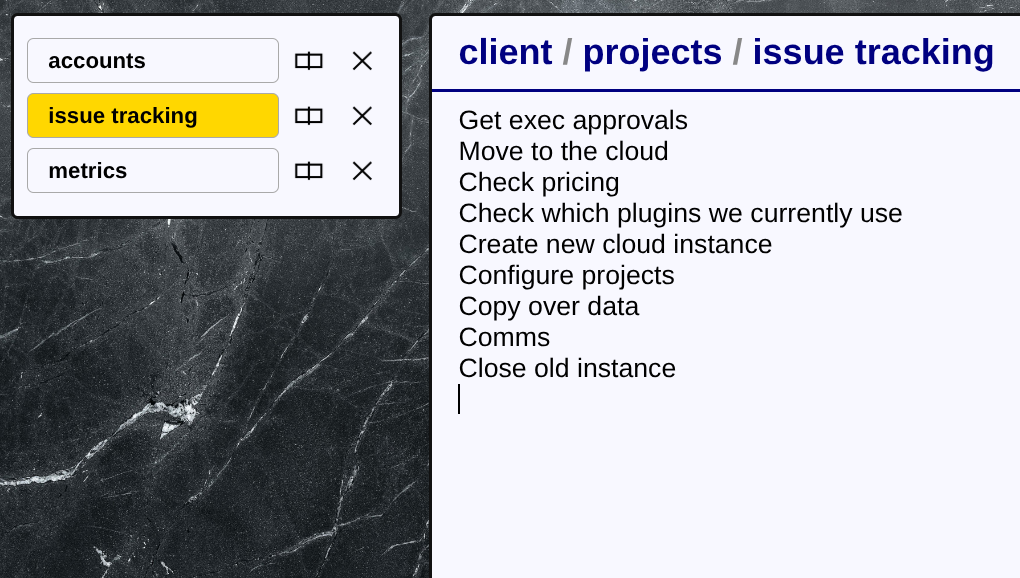
When you open a document, the contents are shown in the text editor, and the document is also added to the open documents pane on the left hand side.
You can quickly switch between the documents you are using by clicking in
the open documents pane. Press the
split screen button
to edit two documents at once.
 Edit -
the text editor, which you use to make changes to the document.
The text editor can also be opened in split-screen mode, allowing you to edit two different documents at once.
2.
 Preview -
a hybrid mode, this shows a text editor in the left pane, alongside the display view of the same document on the right.
If you scroll one pane, the other will scroll automatically to keep the same part of the document in view.
This is good for previewing any formatting changes whilst you make them in the text.
3.
 Display -
a view-only mode, which uses the special mark-up tags inside the text to display it as a fully formatted document.
It is still a continuously-scrolling document (like a web page) but can be printed onto individual pages or
exported to PDF using the
 Print button in the main toolbar.
4.
 Layout -
another hybrid mode, this puts the document in a text editor on the left, with the slide view on the right.
Good for laying out slides.
5.
 Slides -
displays the document as a slide deck, split into individual slides.
There are also buttons in the main toolbar for
 "Distraction free"
and
 "Full screen" viewing,
which apply to any of the Display or Slides modes.
Distraction free removes all the QuickText toolbars and displays the document in the entire browser window,
without any other visual clutter.
Full screen does the same but also puts the browser into full screen mode.
Use the Escape key to exit from either mode.
Headings
A line like this in a QuickText document is a heading:
>> Title
In Slides mode, headings are very important as they mark the start of a new slide, which will have the title given.
In Display mode, there are no slides, but the title is displayed as a large, bold heading at that point in the document.
Be careful to include a space between ">>" and the title.
Sub-headings are written as follows:
> Sub-title
These are displayed as smaller headings, in both Slides and Display mode.
If you know Markdown, the QuickText ">>" is the equivalent of
"#", and ">" is the equivalent of "##".
Paragraphs
To separate paragraphs, include a blank line.
To end the current line, but without the spacing between paragraphs, just use a carriage return.
When entering a paragraph which will span multiple lines in the output, just keep typing without pressing return, and let the editor wrap the lines based on your window width automatically.
This is different from Markdown, where multiple physical lines are joined together to form a paragraph.
Horizontal rules
You can generate a horizontal line across the page or slide with three dashes on a line alone:
---
Spacing
Use the tab character at the start of lines you want to show indented horizontally. A second tab indents further.
If you need extra vertical space, end a line with one or more backslashes:
    First line\\\
    Second line
Each backslash adds half a line height of space, so in this example there are 1.5 blank lines between
"First line" and "Second line".
Formatting for bold, italics etc can be applied inline, so you can change the appearance of part of a line or paragraph, not the whole thing. This is done with special characters before and after the phrase you want to emphasize.
Boldface
The next word is *bold*
Italics
The /word/ is in italics
Monospaced
The `middle of this sentence` is pre-formatted in a monospaced font
Underline
The last word is _underlined_
Strikethrough
The ~error~ word is crossed out
Tip: spaces matter for formatting, so if you're not getting the result you expect, pay attention to the spacing.
For example, to make the word "two" bold you should enter "one *two* three".
Neither of "one * two * three" or "one*two*three" will work,
as QuickText will assume you mean multiplication instead of bold text.
Literals
A backslash before another character tells QuickText to insert the character literally, and remove any special meaning it may have for formatting. For example:
Some \*text\*
This would display "*text*" with real asterisks on either side, instead of in bold face.
Pre-formatted blocks
    `
    These lines are pre-formatted,
    in a monospaced font.
    `
Bullet points
A list of bullet-points is written like this:
    - Item
    - Another item
    - A third item
You can also have sub-items (lists within a list), as follows:
    - Main item
      . Sub-item
      . Another sub-item
    - Second main item
Indentation of sub-items is optional; the important thing is the dot rather than a dash.
Numbered lists
Numbered lists are written like this:
    -(1) First item
    - Second item
    - Third item
This will generate a list where the items are labelled 1, 2, 3 etc.
You only need to put the number "(1)" on the first item; the others are automatically generated.
If you want the list to start somewhere different from 1, put the start point on the first item,
e.g. "(10)" for a list which starts with the number 10 and counts up from there.
There are other forms of ordered list, as follows:
    -(a) Item
    -(A) Item
    -(i) Item
    -(I) Item
    -(o) Item
The letter "a" starts an alphabetic list; "A" does the same but using capitals.
"i" and "I" are for roman numerals.
"o" resets to bullet points if you need to do that mid-way through a list.
You can also start an alphabetic list from a different letter,
e.g. "(c)"; this works for every letter apart from "(i)" or "(o)".
However you start the list, subsequent items can be simply "- Item" and will be numbered automatically.
To display some inline text in a particular color, do this:
Some %red colored %. text
This will display the word "colored" in red.
The available colors are: white, lightgrey / lightgray, silver, grey / gray, slate, darkgrey / darkgray, charcoal, black, cream, butter, lemon, yellow, gold, amber, peach, sand, beige, tan, fawn, orange, ochre, brown, russet, chocolate, salmon, coral, scarlet, red, crimson, ruby, maroon, burgundy, pink, magenta, hotpink, fuchsia, rose, lavender, lilac, mauve, plum, violet, purple, indigo, skyblue, lightblue, azure, blue, navy, mint, cyan, aqua, turquoise, teal, lightgreen, emerald, lime, green, darkgreen, khaki and olive.
 To pick a color visually, press the
"Colors" toolbar button. Clicking on a color will insert it into the text.
"%." means go back to the default text color.
You can also switch directly to another color without "%." first.
The color also switches back to the default automatically at the end of an input line.
Tables are used in QuickText not only for tabular information, but also commonly as grids to lay out content on the page. They have a lot of options but it's important to master at least the basic table and grid.
A basic 2 row, 3 column table looks like this:
    | First column | Second column | Third column ||
    | Second row, first col | Second row, second col | Second row, third col ||
Every table row must start with a "|" and end with "||".
Note this is different from Markdown, where outer dividers are not required.
In QuickText you are however free to split a table row across multiple lines, for example:
    |
    This text appears in the first column,
    and can be arbitrarily long.
    |
    This text goes in the second column;
    again it may span many lines.
    ||
A table ends when any line after "||" does not begin with a "|".
Formatted tables
To customise your table, include one of the following directives on a line just before the table begins:
    %table [columns] [options]
    %chart [columns] [options]
    %cols [columns] [options]
    %rows [columns] [options]
    %grid [columns] [options]
[columns] and [options] are optional parameters explained below.
%table" generates a standard table with thin lines separating all the rows and columns,
and around the edge of the table.
"%chart" is a more visually elegant presentation, with only the most important separating lines.
"%rows" is a format which omits the vertical lines but shows horizontal lines between each row.
"%cols" is for multi-column layouts; often you will just have a single row in this type of table,
but with a whole column of content in each cell. The only decorations are bold vertical lines between the columns.
"%grid" leaves out all the separating lines entirely, and is commonly used for building grid layouts.
There are no table decorations so the focus is just on the content.
There are shorthands for the more common of these table types:
you can use "%t" for "%table", "%g" for "%grid",
and "%c" for "%cols".
Columns
The [columns] part of the table directives allows you to specify the widths of each column in the table,
as a percentage of the overall width. If you don't do this, the width is divided equally amongst the columns.
For example,
%table 20 30 50
specifies a 3-column table in which the first column takes 20% of the width, the second column 30%, and the third column 50%.
You can optionally follow any column width with a "l", "r" or "c"
to indicate that it's contents should be left-aligned, right-aligned or centered respectively.
For example,
%grid 10l 30 60r
defines a grid in which the first column is left-aligned, the second column is centered (since that's the default alignment for grids), and the third column is right-aligned.
Styled columns
For fancier tables, you can add color directives between the column widths. This changes the text color for every cell in the effected column[s].
You can also wrap any column width in the box notation (see boxes, below). This will automatically wrap every cell in that column in a box of that type. All box types are valid, including color filled boxes.
For example:
%grid 20 %red 20 20 %. 20 {:20}
This defines a grid with five equal width columns.
The second and third columns consist of red text (the color resets at the "%."),
and each cell in the fifth column is wrapped inside a standard box.
Table options
[options] may include:
"headers" - indicates the first row are headings, and should be emphasized.
"leaders" - indicates the first column are headings.
"striped" - applies a background stripe to alternate rows.
"center" - vertically centers table cells.
Merged cells
You can merge adjacent table cells to make larger rectangular cells.
If a table cell contains only the content "..", it is merged with the cell immediately to it's left.
If a table cell contains only the content "^^", it is merged with the cell immediately above it.
Insert an image like this:
!ImageName
 Pressing the Gallery toolbar button lets you select images easily;
clicking on an image in the gallery will insert it into the text editor.
Use the Upload toolbar button to upload an image to the Gallery, or drag and drop any image into the gallery. The gallery sorts images by date added or alphabetically, and groups together portrait and landscape images.
Images always expand to fit the horizontal space available (they are blocks, not inline elements like text). Whenever you need to control an image's size, or layout multiple images side by side, place them within a grid (see Tables). Any grid or table cell may contain an image.
Glyphs
Glyphs are useful icons which you can insert into your presentation to make it more visual. Insert a glyph like this:
!GlyphName
Since they are referenced in the same way as images, you can't have an image with the same name as a glyph.
 Pressing the Glyphs toolbar button shows you the available selection of glyphs.
Clicking on one will insert it into the text editor.
Unlike images, glyphs are displayed at a fixed size and do not expand to fill the space. They are still formatted as "blocks", however, and not inline content like text. The upshot is that if you need to lay out multiple glyphs side by side, put them in table/grid cells as you would for images.
Wrap text in a box using one of the following seven types of box:
    {: A standard filled box, with a neutral color }
    {; A more vivid filled box, using the theme color }
    {= A dark box, with light text }
    {. An outline box, not filled }
    {%color A box filled with the specified color }
    { A box with no decoration at all, just for grouping }
    {X A hidden box; the content is not shown in the output }
Boxes may also contain images and tables.
Nested Tables
In addition to the visual impact, since boxes can appear inside table cells they are used to
nest tables inside another table, creating complex layouts.
If you want to do this invisibly for layout purposes,
use the undecorated "{ ... }" form of box to contain the inner table.
As a reminder, slides are indicated by the headings in the document, e.g.
>> Slide title
There are also various features you can turn on for specific slides, as follows:
Sidebars
Sidebars are special kinds of boxes. Wherever they are defined within a slide, they are always displayed as a sidebar alongside the main slide content, filling all the space vertically between the heading and the footer.
    {>N ... } - left  sidebar, no styling
    {<N ... } - right sidebar, no styling
    {)N ... } - left  sidebar, separating line
    {(N ... } - right sidebar, separating line
    {]N ... } - left  sidebar, filled
    {[N ... } - right sidebar, filled
"N" is the percentage width of the slide that the sidebar fills, for example "{<20 ... }"
indicates a left sidebar which occupies 20% of the slide width.
You can leave out "N", in which case the sidebar will be 30% of the width of the slide by default.
Backgrounds
Add the "%background" directive into a slide's content to specify an image or solid color name
to form that slide's background, instead of the usual white.
    %background !ImageName
    %background color
You can use "%bg" as a shorthand for "%background".
Hidden slides
A hidden slide is defined like this:
>>X Heading"
The contents of any slide starting with ">>X" will not appear in the output,
but are still present in the text document.
Sections
When you have a lot of slides it's a good idea to split the deck up into sections.
Introduce a new section with the "%section" directive:
    %section Section title

    >> First slide in the new section
The automatic table of contents slide (see Decks) will list sections in addition to or instead of individual slide names, depending on how many slides there are.
QuickText can generate a title slide, table of contents slide, section start slides, and a questions slide automatically for you. It can also generate footers for regular slides. To benefit from these, you need to place some of the following directives at the top of the file:
    %title Title text
    %subtitle Subtitle text
    %date Date text
    %author Author's name
    %contact Email address or other contact details
    %logo !ImageName
    %titlepic !ImageName
    %questionspic !ImageName
    %sectionpic !ImageName
    %background !ImageName
    %background color
 An easy way to add these directives is to press the
Deck Info toolbar button, then fill out the fields provided.
The minimum to get a title slide is to include "%title". Title slides show the title, subtitle,
date, author's name, title picture and logo, if provided. The title is also shown in slide footers.
The "Questions?" slide at the end of the deck includes the author name and contact details, as well as the questions picture.
The section picture is used as the background on each start-of-section slide.
If you put a "%background" directive at the top of the document (anywhere before the first heading),
it becomes the default background for all normal slides in the deck.
If you don't want some of the auto-generated material, add a "%no" directive followed by one or more keywords:
%no [title] [contents] [questions] [footer]
Finally, you can control what happens if there is too much content to fit on a particular slide.
By default it is cropped and you will see a "[...]" indicator to show that something is missing.
If you include the "%autofit" directive however,
QuickText will attempt to scale fonts down to make long slides fit.
There is a limit to how far it will scale down,
so you may still see the "[...]" indication if content does not fit even when scaled down as far as possible.
%autofit
| Cursor up / down | Select document or folder |
| Return | Open selected document or folder |
| Backspace or ^ | Go to parent folder |
| / | Go to top level |
| | | Split screen folder view |
| + | Create document or folder |
| # | Rename document or folder |
| Alt - D | Duplicate document |
| Delete | Delete document or folder |
| Alt - , | Hide open documents list |
| Alt - . | Show open documents list |
| * | Add document to open documents list |
| Alt - \ | Split screen editing |
| Insert | Open image gallery |
| Shift - Insert | Open glyph selector |
| Alt - C | Open color picker |
| Alt - I | Edit deck information |
| Escape | Close document and return to folder view |
| Cursor down, Page down, Space or Return | Next slide |
| Cursor up, Page up or Backspace | Previous slide |
| Home / End | First / last slide |
| = | Distraction free view |
| + | Full screen view |
| Escape or Backspace | Leave distraction free or full screen view |
| Alt - X | Export to PowerPoint |
| Alt - P |
| Cursor keys | Select image |
| Return | Insert selected image |
| Alt - U | Upload image |
| # | Rename image |
| Delete | Delete image |
| Alt - R | Replace image with another file |


